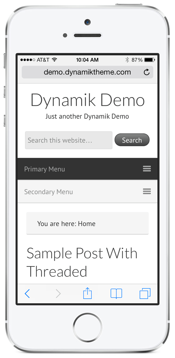
The Dynamik Website Builder and Genesis Extender 1.2 update was all about the Custom Options, providing several new powerful tools to display your content and structure your pages and posts. But Dynamik 1.3 is ALL about design, both in the “defaults” department as well as the way it responds to tablets and mobile phones.
Our main emphasis with 1.3 was to not only completely redesign the default styles of Dynamik (check out the updated Dynamik Demo Site), but to refine and enhance both the options that already existed as well as add any necessary options to bring it all together. Previous features like the various mobile menus have been completely reinvented to provide the best possible experience for both the developer as well as the site visitor. And a few new design options have also found their way into Dynamik to provide the end-user with an even more complete package to build their latest custom WordPress websites.
If you’d like to play around with the updated Dynamik Demo site in terms of viewing on various devices you can check it out on the Screenfly tool found over at QuirkTools.com. Read more “Dynamik Website Builder 1.3: New Default Design And More Responsive Than Ever”
