
With Dynamik Website Builder 1.4.2 hot off the presses I thought I’d take a moment to share one of the new features found in this latest version of our flagship product.
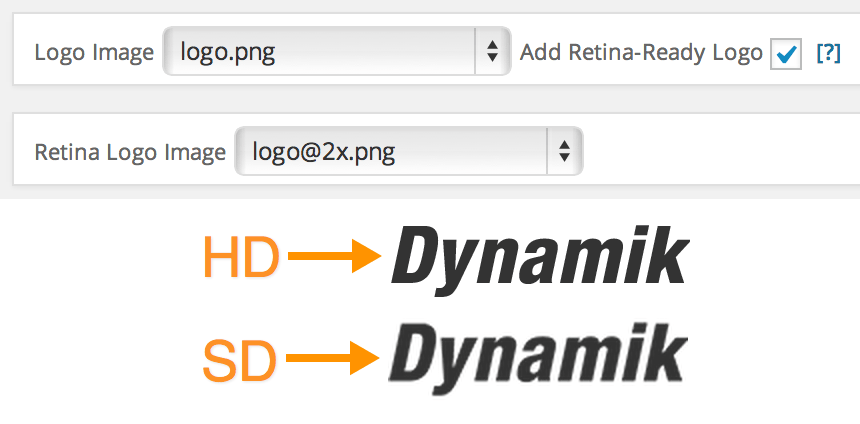
This new feature gives you the ability to easily add a “Retina-Ready” (High Definition) version of your site’s logo, ensuring a crisp and clear rendering of your brand on high definition displays. From iPhones to iPads to MacBook Pros to Google’s HD tablets, your logo will take full advantage of those extra pixels instead of becoming blurry and pixellated.
All you have to do is upload a high definition version of your logo image (in addition to your standard definition logo image), exactly twice the size in pixels, and then simply select a checkbox and then your HD logo. Then after saving your changes Dynamik will do the rest.
At this point Dynamik creates all the necessary CSS code to display either your SD or HD logo accordingly. And since the HD version is displayed through CSS @media queries this new feature is fully backward compatible with Internet Explorer versions previous to IE9.
So from now on when you want to add a high definition logo image to your Genesis/Dynamik powered website all you have to do is upload your HD version, select a few settings and then let Dynamik will do the rest.
Follow & Share: