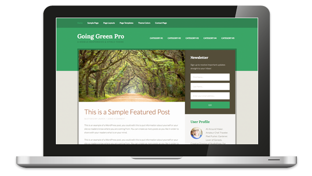
 Today, the Going Green Genesis Child Theme was updated to version 3.0. Its a beautiful update packed with 4 color options (Default, Forest, Mint, and Olive) and support for the Genesis 2.0 goodies.
Getting the stock setup online, took no time at all, thanks to the simple setup steps (Login Required) StudioPress provides.
I dare say, green bloggers are going to make a bunch of folks green with envy by using this beautiful Genesis Child Theme to showcase their content.
What about non-bloggers, who need more of a CMS styled home page for their website? I have a Forest Management client that this theme would be perfect for, other than the blog page being his home page.
Good thing I have the Genesis Extender Plugin.
Home Page
What if you want to use the Going Green Child Theme but you need your home page to have more of a CMS layout, ie one that is not your blog page?
Genesis Extender Plugin
It could not be easier to take control of your home page and use your choice of the 49-one-click EZ Home Page options. Of course you will want to start by installing the Genesis Extender Plugin.
Once installed and active, on the front end of your website, you will still see the default Going Green home page.
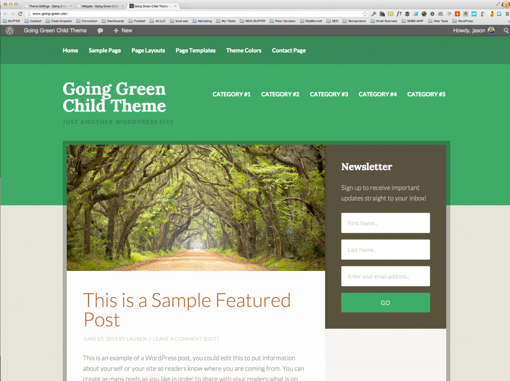
Thanks to the Genesis Extender Plugin, changing the home page and keeping your blog page, is greatly simplified.
6 Steps to CMS Home Page
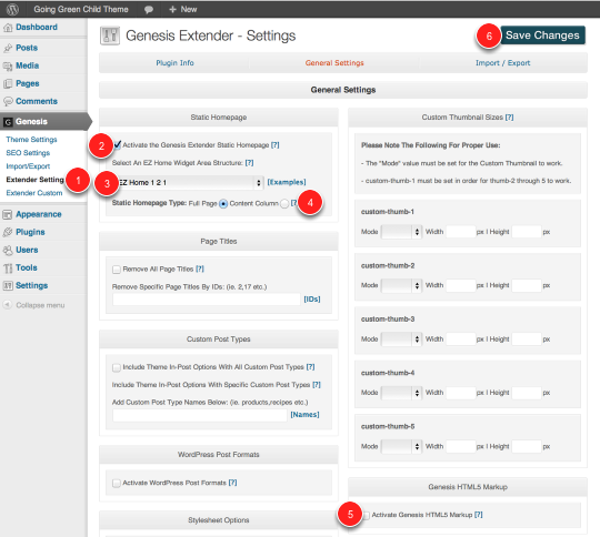
- Choose Extender Settings from the Genesis Panel
- Check the box to activate the Genesis Extender Static Homepage
- Choose from the 49-one-click home page setups
- Do you want your EZ Home Setup to display within the (A) full page or within the (B) content area? Option (B) allows you to display your sidebar(s) in addition to your content area.
- Check the box to turn on HTML5 Markup for the Going Green Child Theme
- Click the green Save Changes Button
Now your home page looks like this:
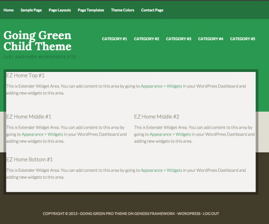
I chose the EZ Home 1 – 2 – 1 and I chose to have it take up the whole home page (so no sidebars are displayed). Now I can add widgets to these areas in order to finish out the page. First though, lets add a bit of padding to the home page area so it looks like the rest of the theme.
Lets activate the Front End CSS Builder
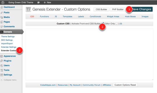
- Choose Extender Custom under the Genesis Menu
- Toggle on the Front-end CSS Builder
- Click Save Changes Button
Go back to the home page
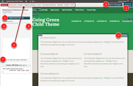
- Click the green button to show the CSS Builder
- Click the (at the time) Red Enable Elements Button.
- Click on the Element Selector which will include the element you want to style, in this instance the EZ Home Container Wrap
- Choose the Elemnt you want to style from the EZ Home Elements Drop Down menu
- Click the double arrow ( >> ) to insert the CSS selector into the css staging area
- Complete the CSS using the CSS Builder tabs from the top, in this instance I used Margins & Padding and added 20px of padding to each of the four input boxes (top, right, bottom, left)
- Insert the CSS into the Custom CSS editor, so that it can be saved. If you leave it in the CSS staging area, it can NOT be saved
- Click the save changes button
Now, about that Blog Page
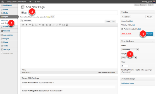
Go to the WordPress Backend and click the Add new Page under Pages
Give your page a name, I chose Blog
Assign the Blog Template from the Templates drop down
Hit the publish button